This is the beginning of a new series here as I've decided to dip my toes in the field of Logo Designing. This caters to my love for typography, design and art.
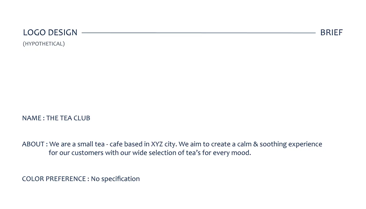
For my first self-commissioned project, I firstly created a Logo Brief containing the bare minimum of information required to initiate the project. Here I have as my Client, a tea - cafe with their own selection of Tea's, named 'The Tea Club'.
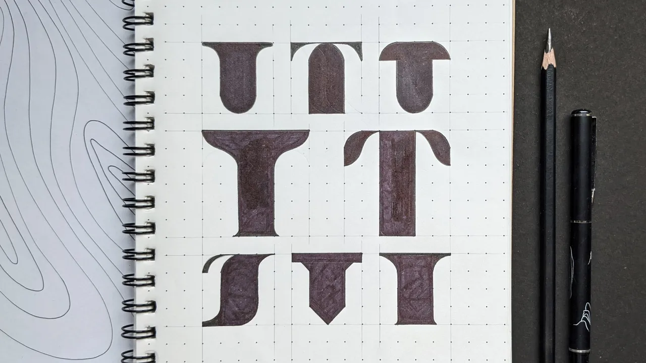
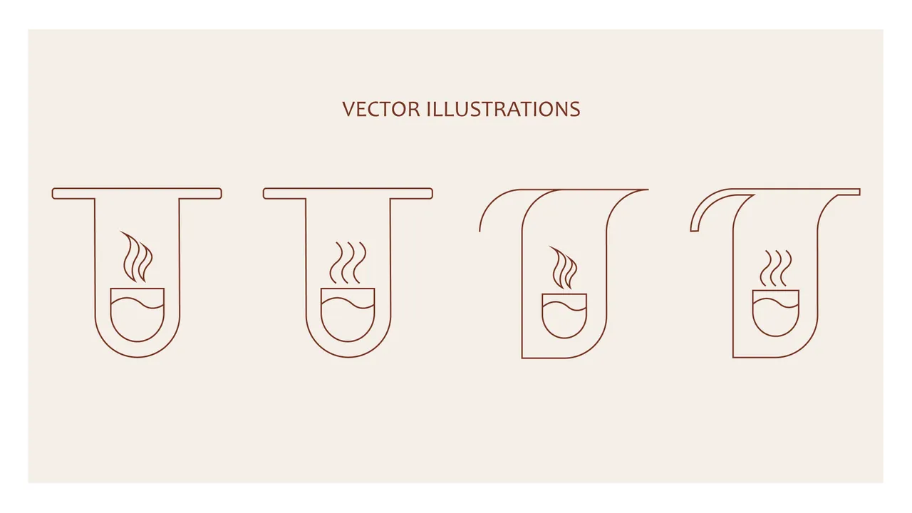
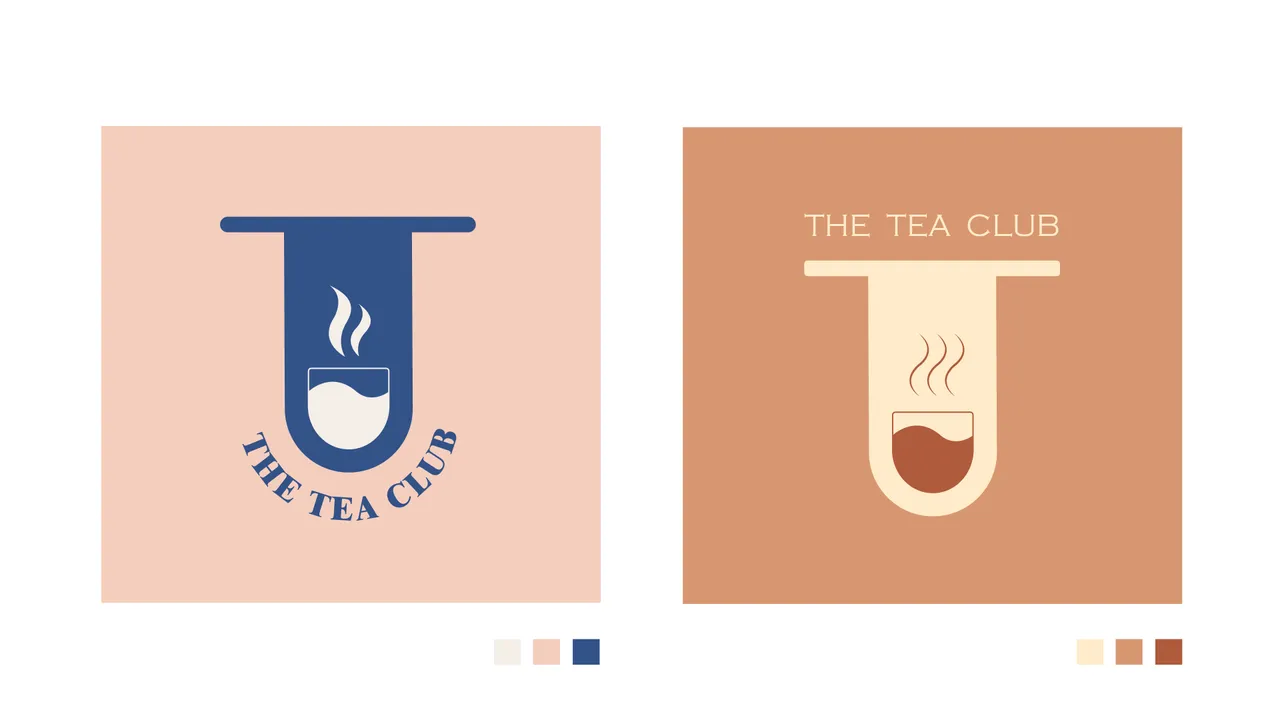
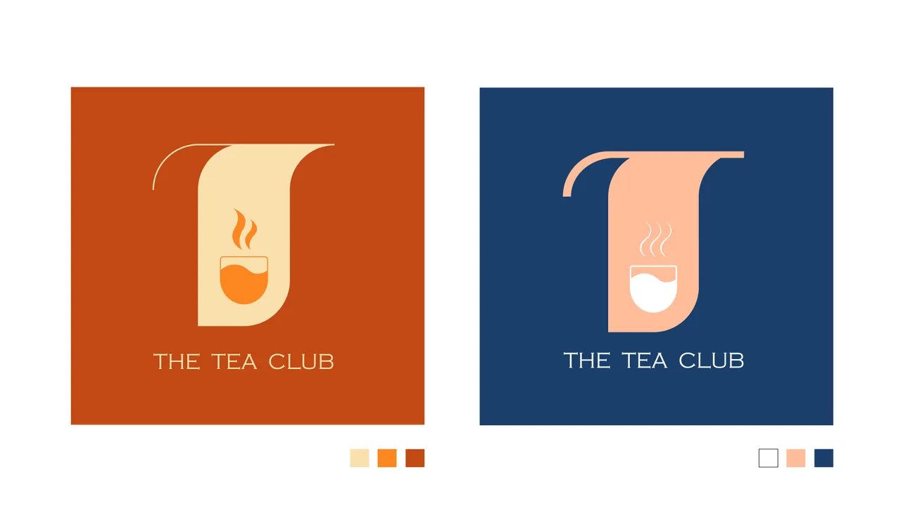
For this logo, I wanted to play around with the letter 'T' and created some sketches to include an illustration of a steaming cup of tea. With two color palettes, I played with tints and tones to create these four variations.
So, which one do you like the best?