Line chart
Line chart is a simple chart which is giving us overview of the price change for a specific period of time. This is not any Complex chart rather it's very simple to see the price change and its pattern at a glance. Line chart is nothing but the connecting of the closing price and when this points of closing price joins, we can have the line diagram which is showing the pattern of price change for a specific time period.
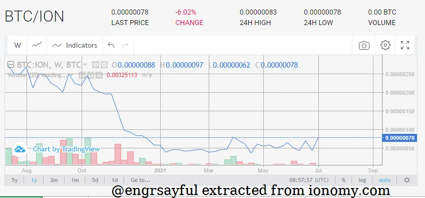
To check the overall trend this is very useful and simple chat for any specific asset’s data for technical analysis. This is as simple as anyone can interpret the chart very easily those who don't have any knowledge on trading or chart.
This is just about Trend and from the line chart it is easy to understand some other parameters and trading theories e.g. support and resistance etc easily. This line chart is being used for many kinds of analysis in different theories.
Analyzing trend from line chart:
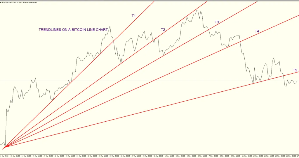
Source: https://thesecretmindset.com/trade-line-charts/
Depth Chart:
Where it is matter of trading then it should be kept in mind that how much of asset is available to trade like for selling and buying. It is really important to know the volume of the demand and supply of the asset in case of exchange of any currency in trading market. So, only price cannot give us the whole picture because there may be high price of demand but how much amount of assets demanding that is also important.
Maybe someone is willing to purchase any currency at very high price but how much amount of currency he is willing to buy that is another important factor and similarly vise verse in case of selling as well. If we have the greater price or better price in the candle chart but don't know about the volume of demand and supply then it is very problematic for us in a high scale transaction. So here is a depth chart which is the solution of this problem.
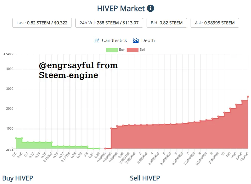
In depth chart we can see the price and at that price how much amount of currency is available to sale or buy. In the following chart you can see the red part is more and the green part is less. Red one is for selling and green for buying. In the bottom line, you can see some numbers like 0.5, 1.2, 3, 5, 6 etc. These are the price of trading and in the vertical line you can see the volume of the amount of currency is available to buy or sale at that specified price. This picture or chat is easily showing us the availability of the currency in the market for buying or selling. From Depth Chart we can decide at which price how many of the asset or currency can we can buy or sell.

Who I am
This is Sayful
Ex Banker
Part time blogger
By Profession Lecturer
Fasinated by Nature and Cricket
Day dreamer and a round pig in square hole
Write on Textiles, Online Money Making, Agriculture & Technology
Upvote, Reblog and Follow me on hive @engrsayful

This is Saiful’s Classroom from @engrsayful
Find me on
Facebook Twitter Instagram Youtube ThreeSpeak DTube
Ex Banker
Part time blogger
By Profession Lecturer
Fasinated by Nature and Cricket
Day dreamer and a round pig in square hole
Write on Textiles, Online Money Making, Agriculture & Technology
Upvote, Reblog and Follow me on hive @engrsayful
This is Saiful’s Classroom from @engrsayful
Find me on
| Youtube | ThreeSpeak | DTube |