When testing the words "brush strokes" and "brush stroke" the software created images that had sort of canvas colored, beige/white, backgrounds. Today I wanted to see if I could change the color of the background using the addition of "on black background" and "on red background". I picked "black" since it was the opposite or near opposite of the background the software was creating and picked "red" randomly so I had something to compare the previous test to, other than the original "brush strokes" image.
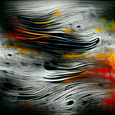
"brush strokes on black background"
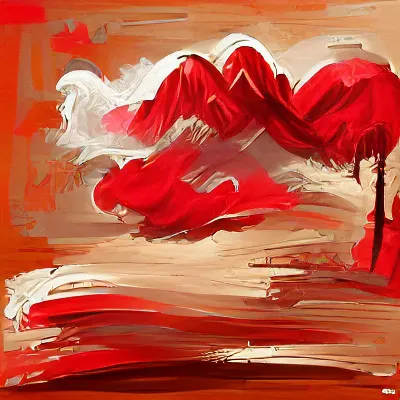
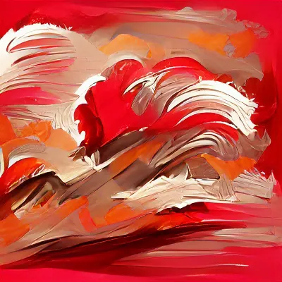
"brush strokes on red background"
vs
"brush strokes"
Adding "on black background" does appear to change the background to a darker color, mostly grey to black, and kept the blue and reddish colors. There is still a lot of white in the background but it is a different color. It also changed the style a bit as well. The style looks more digitally warped now.
Using "red" instead of "black" also made a difference in the background but changed the colorscheme much more. Now there is mostly just reds and even the whiter/tanner colors still have a hint of red in them.
Both images were created with the added background color to the edges more.
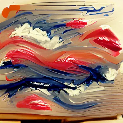
Now, let's take a look at how the software creates the images using the word "with" instead of "on".
This made a big difference for the "black" image and less so but still a difference for the "red" image.
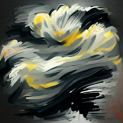
"brush strokes with black background"
"brush strokes with red background"
vs
"brush strokes"
The "black" image is much more similar to the "red" image this time. Both have a similar centered wave like movement. The "black" image now has a very difference color scheme as well. Both seem to have more of a background that is the color I was trying to make them and have more monotone color schemes with minimal realistic paint brush texture.