Greetings Illuminated Hiveminds
Last month I was struggling with a few deadlines for Logo Designs and Trademark Nomenclature, UX Guides etc. I also add a short Business outline and a deployment strategy. By combining various methods in one, I developed my own. Inspired by various approaches, such as The Grid and ideas from the https://www.strategyzer.com/ books, I came up with a rather holistic way to view start ups from various angles.
I'd love to know any more books like these, so if you have any you'd like to share in the comments below I'd appreciate that greatly.
Do you know that feeling when you sketch, throw a way a sketch, and repeat that process until you end up with a bin full of wrinkled sketch papers? Maybe it's because you have too many projects and you can't work under pressure? Isn't our performance better when we work for our own projects?
The artists I know of, use their distinct signature style to do most of their assignments. I therefore really appreciate artists who can explore all kinds of style omnidirectional.
I decided to post a bit of the illustrations try outs I made. These all landed up in my imaginary dustbin, but Decided to post them anyways.
I started with a few Logo tryouts, just testing a bit.
The Story
First the Logo started with a sketch on a piece of paper:
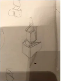
I then mapped out the Logo by creating a vector version of it along with quite a few other sketches like this.
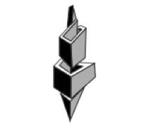
After I had the sketch on inkscape, I tried mapping out some circles for maintaining aesthetics, created another sketch and colored it.
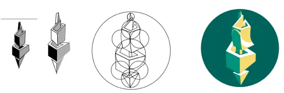
The company I did this for manufactures polyester staple fibre from recycled PET and have quite interesting fabrics they develop. Therefore the idea was a twist, thread or spun yarn of fibre depiction. All their facilities are powered by solar cells and wind turbines, making all their processes powered by renewable energy.
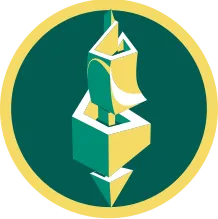
A Logo Version
Recently I thought about adobe softwares and decided to use alternatives like inkscape instead of illustrator, gimp instead of photoshop.
In this post, I will show the work that finally wasn't used for anything.

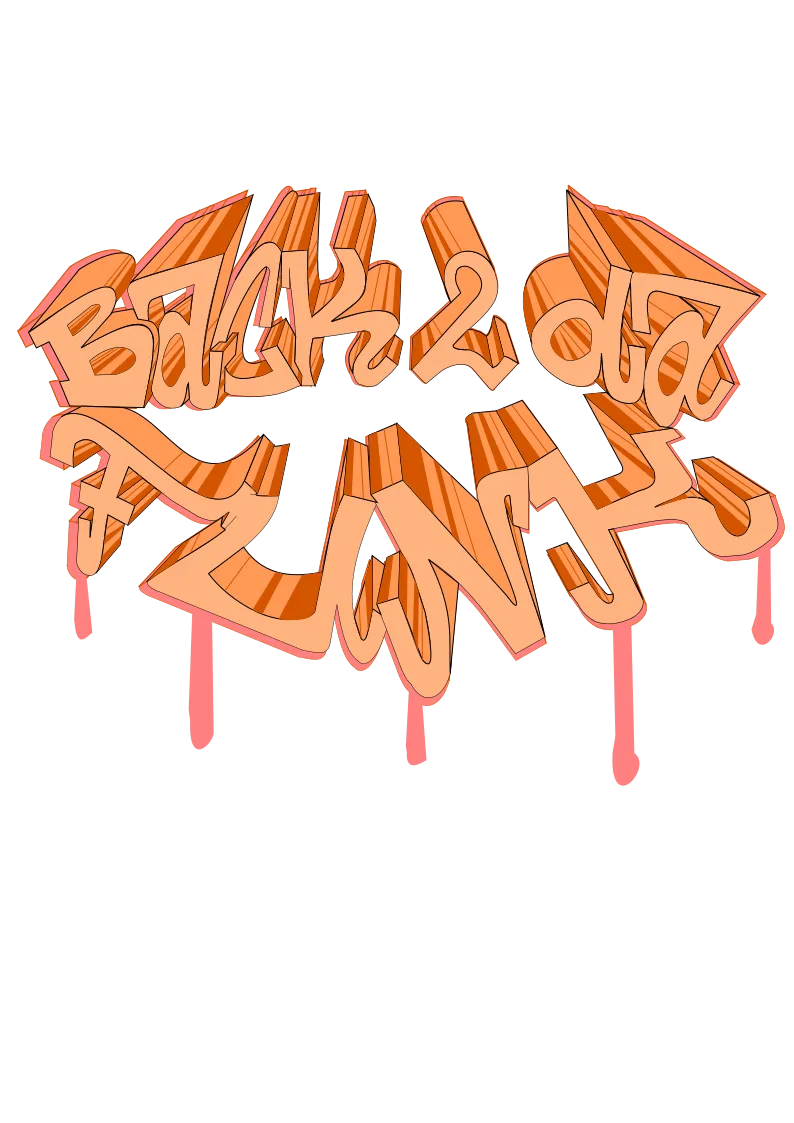
Back to the Funk
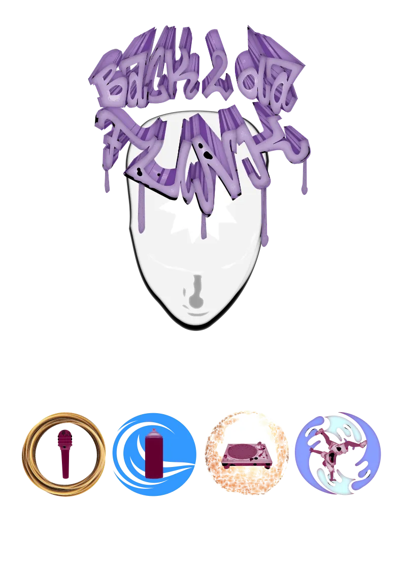
Taking a similar method as above I sketched out some letters and then tried to incorporate the 5 elements of the Hip Hop culture. My initial sketch idea was a quite different one, because I see seven elements in my mind. The idea my friend @kunoichi had, was to incorporate the elements of earth, wind, fire and water.
The Process
I started again by sketching with pencil on paper and taking a picture of the sketch on paper, then tracing and coloring it using inscape:
I will skip to the part where I had a version I didn't like with all the elements:
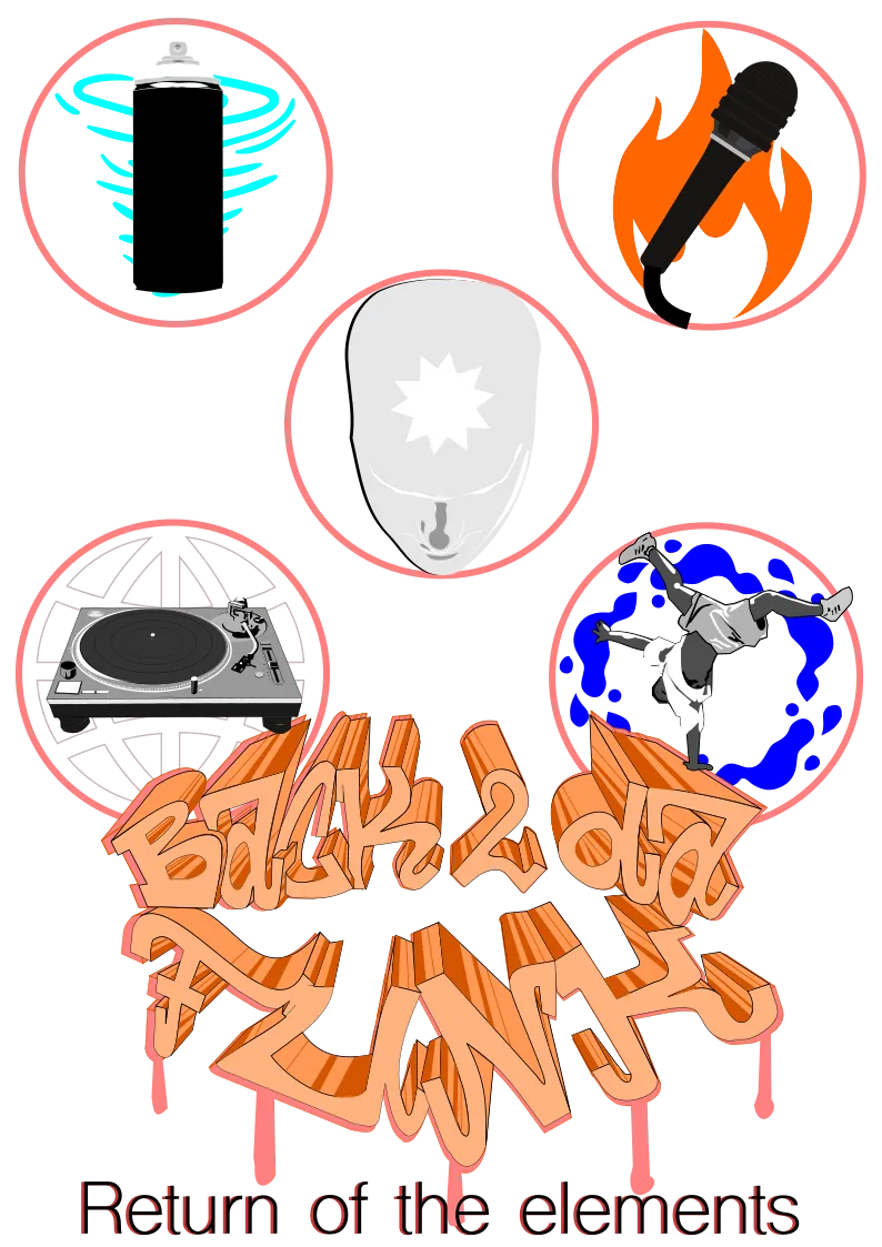
Still an idea, I changed it up until I was left with this:
As this was voluntary, a few others worked on their version meanwhile.
I used to have phases where I wasn't too happy with what I did and I ended up throwing away a lot of scrap paper when I was younger. Each try although was an exploration I made. I don't think I will ever go down this route again, but I learned a lot from this experience.
They finally decided to go for a logo, rather a silhouette.
'When one believes in infinite freedom, the question remains if any limitation we could set is just within the human mind. Once we break free from that, we become who we truly are, beyond the human mind. A spirit elevating into higher consciousness beyond the physical, awakened within the present frame. A mind focused on presence unleashes all power in the universe from within' - @yangyanje
 Join the holistic health economy on hive!
  Meditate with the Hivemind