Earlier this week I was searching through my feed as I do and found an amazing design opportunity, these don't come often for me so I was super excited. However, the caviat to this is that I like to say I do logos but I have practically zero experience for a professional "customer".
Info Bar - The competition is held here and being hosted by the OCD team. In short, make a logo with OCD (No dots) in a company style logo. You can get bonus points for introducing fish or a whale into the design somehow, but it is not necessary.
A ton of my experience is around the gaming and livestreaming field where we aren't looking for professional, but more "Oh that looks sick!!" kind of reactions. This wasn't going to stop me though! I immediately started to think of ways of introducing simplistic ideas into a the initials of OCD and POSH.
I began with my idea of having a whale shadow and have the letters form into the whale but it just didn't work out. I worked for probably four hours and needed to take a break as it looked awkward no matter what I did.

I know... can't even tell the red says OCD. Back to the drawing board it is...
Over some nights to think more, I decided to "think outside of the box" but it ends up being ironic to say that when you see what I chose to do.
My next idea was to scrap the whale and just try to make a cool design with OCD connected to each other somehow, but it quickly came to me that connecting these letters would be hard without a major overhaul. That's even before thinking about readability from scaling the image down, so nothing really came out of this.
Luckily, I had one more idea... its typical and basic but it never lets me down. But before we get into the final design sketch for the OCD logo, may I say, this became a lot harder than I originally thought after the failure of my first idea. Really made me reach deep inside of my mind to make something creative and look flattering. Anyway, back to the good stuff!
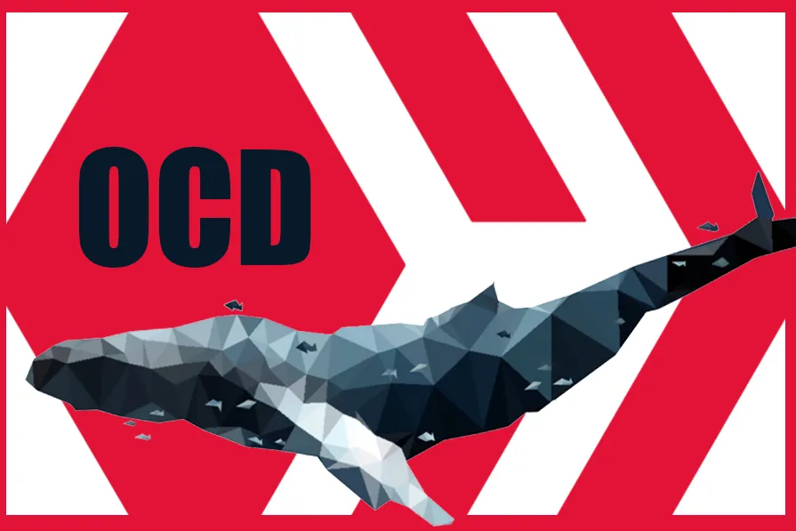
I had thoughts of doing this kind of idea, but I felt it would be extremely hard to do, but once I got going it became really easy and turned out better than I could have ever expected. It has elegance, bit of complexity, but also simplistic at the same time like it should be.
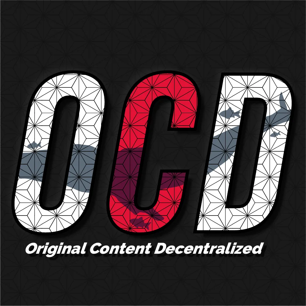
I kept the original background to show the seamless transition that can be made with this design, keeping the same font shape but also making drastic changes that would be complimented even on its' own. I did have to rasterize the background in a weird way so it does look quite different from the original, but this is only a reference along with a higher quality version most likely being available to the OCD team.

Provided is a transparent background to make it easy to put over anything that is chosen in the future, I feel this is extremely useful as only a simple design program is needed to merge over.
I personally pushed myself to require a whale and fish as it is the main symbol for OCD and makes a ton of sense to even the newest Hiveans. Even if you don't know what OCD stands for, the whale and fish give people another way of understanding. I am extremely happy with how it turned out, and even at the smallest scale, the letters are easily readable for any project that this is slapped onto.
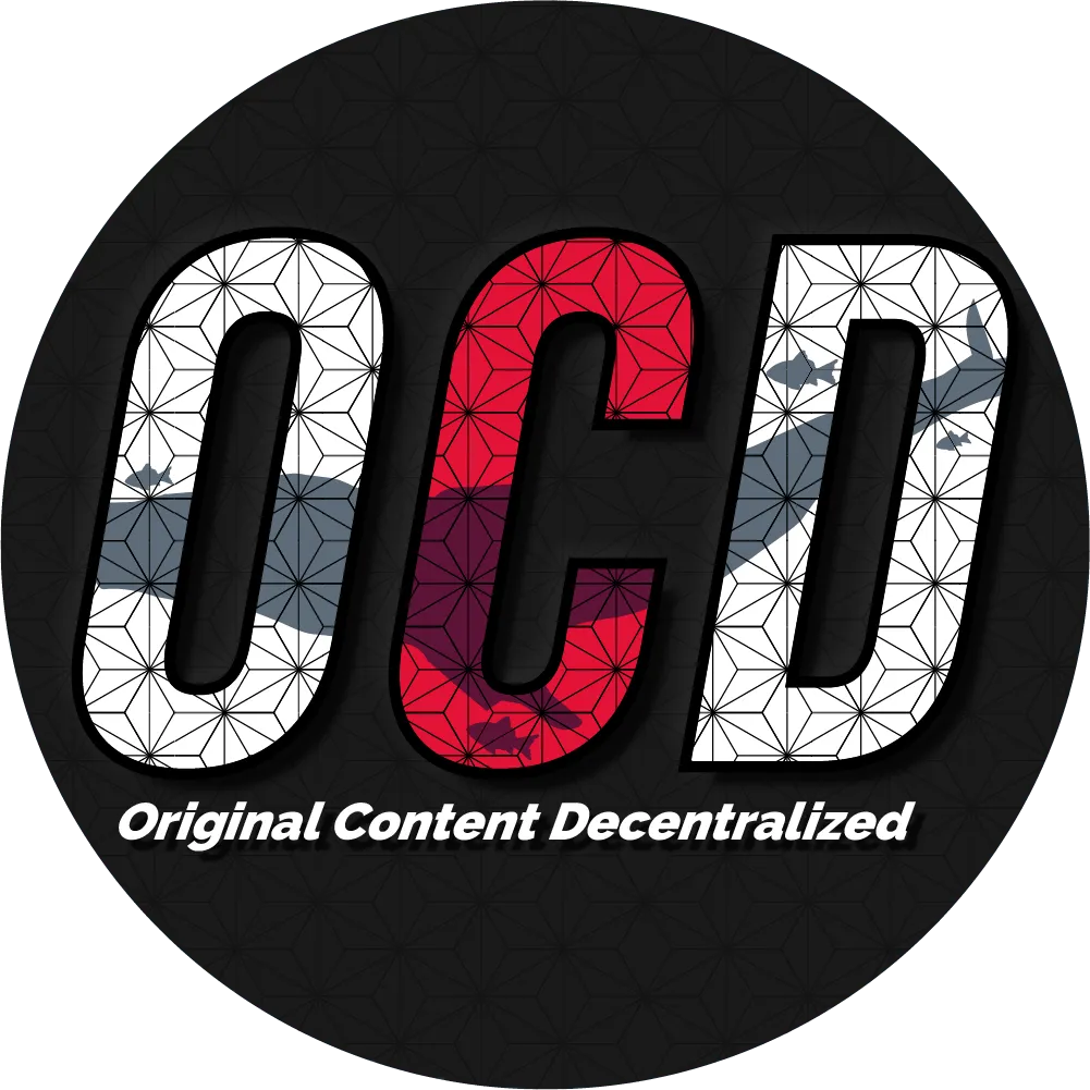
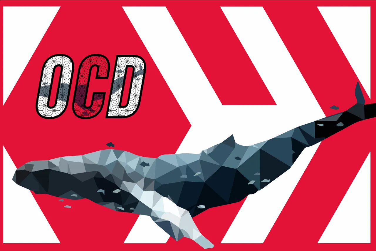
In these profile picture-type formats, I felt it was a nice addition to write out the explication for those of who want to understand what OCD stands for. The logo design is kept the same as above but I highly opposed a simple black or flat colored background, so I added the same pattern on the logo to the background, but in a ghosted effect to add depth but not take away from the logo at all.
Now as I am new to something as business-like as this, I want to make sure to tie all of my loose ends by offering up the AI save file as well as the SVG format so that it can be changed, scaled, etc. without needing to contact me. However, I would be more than happy to edit if requested if this does somehow win.
After being frustrated from the failure of my previous OCD attempts, I moved over to making my POSH logo and had much more luck working on this. I loved it... until I finished the other, but that isn't going to stop me as I could just be hyper-critical. Surprisingly, my first design sketch worked out great and I didn't have too much struggle making it the way I had it in my head.
The Idea - A sharing icon, but with POSH written inside of the Icon kind of encapsulating itself. I could have went with the globally recognized format, but I wanted it to be different (feeling others would do the same) so I took inspiration from the old Apple share icon.

I love the look that this icon has, and there is a ton of potential for editing to look futuristic and modern. I wanted a futuristic theme as most of us all believe crypto will be the future to a decent extent, so why not make it look straight out of the future?
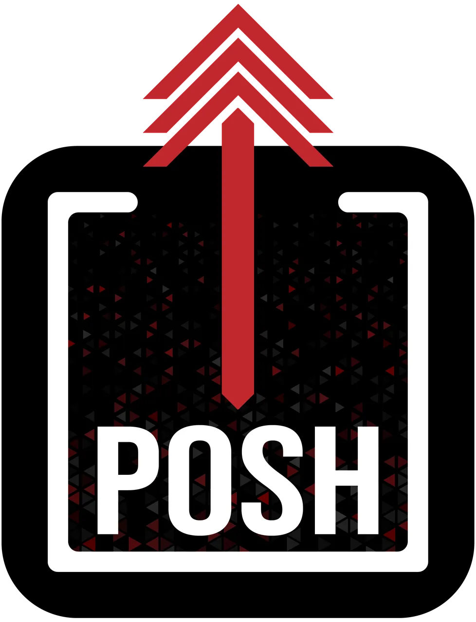
I was not sure to what extent the logo needed to be formatted as, so I tried to fill all spots and leave no area for compromises. Despite its' decent size, it is massive in comparison to anything that it may be put onto.
There are a ton of colors too, so I made a black background encasing everything so its almost impossible to not see the POSH letters. This will also look good with a white background or just a black background too.
Adding three vector arrows on the top I think was a great idea really pushing the futuristic vibe along with relatively matching the Hive colors/design angles.
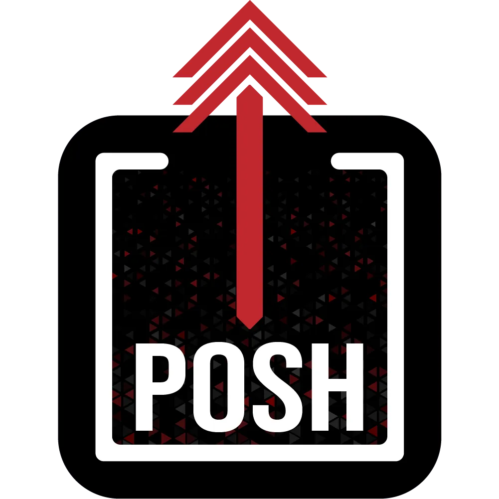
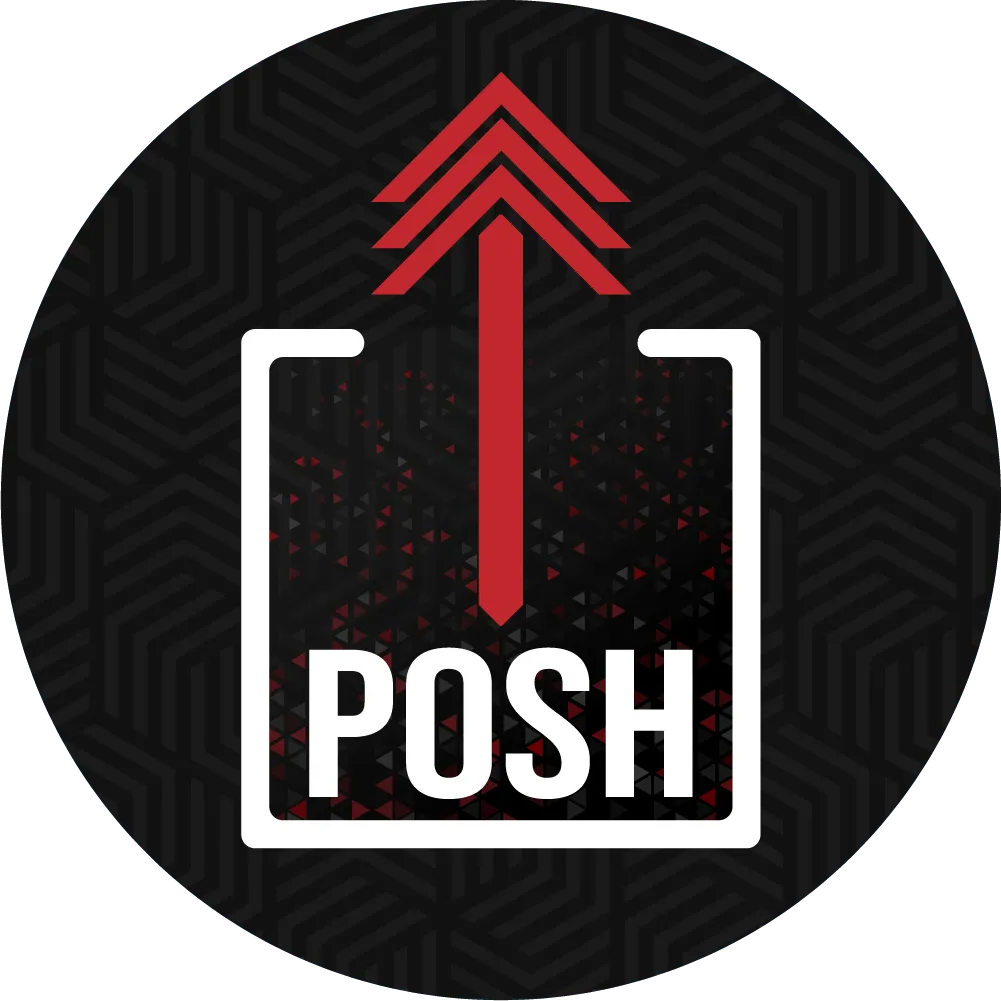
While in process of making both designs, I saw a comment talking about being in a circle format possibly for the POSH Token, I am not sure if it will fit the bid of what is needed, but I did my best duties to make it match and work well as the currency token as well.
Again, I absolutely HATE flat black backgrounds! In effect, I made another ghosted pattern in the background of the circle that uses the same three vector arrow idea... See what I did!?> I thought that was pretty cheeky when I added the background.
So there we go... I hope I did both OCD and POSH right with these designs, a ton of thought and creativity was put into these and I just hope they are seen in the light that I see them in.
As this is a contest and rights are being pushed off (giving them permission to use our designs) I thought I would share everything so if anyone has suggestions or edits, then they are welcomed and free to do so.
Good luck to everyone else that has attempted this contest, and I look forward to seeing more as time draws closer to the end of the competition.
All Files talked about or used
Until next time...