Versión en español
(The English version is below)
Desde hace relativamente poco, aproximadamente un mes, he estado practicando mis habilidades en dibujo y pintura. Pasé de no saber hacer nada, a lograr hacer dibujos bastante decentes, en mi opinión.
Mi objetivo es ir mejorando cada día, probar cosas nuevas, ponerme retos e intentar superarlos. Recuerdo que el primer dibujo que hice fue el de un búho, luego hice un oso panda. Ambos dibujos eran parecidos a personajes de cuentos infantiles, gorditos y con los ojos enormes.
Pueden ver las publicaciones donde compartí esos dibujos siguiendo estos enlaces:
Búho: @gaboamc2393/weekend-of-seeds-painting-and
Oso panda:@gaboamc2393/drawing-2-little-panda-engesp
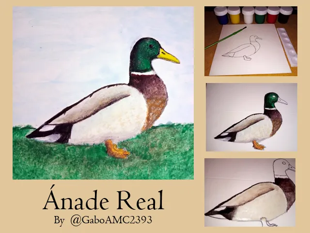
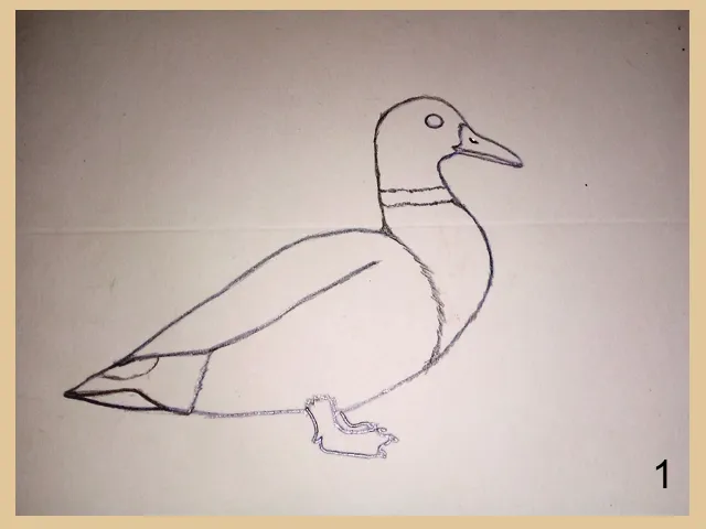
Pues bien, estuve practicando con otro tipo de dibujos más cercanos a la vida real, fue así como me propuse dibujar un pato. Hice varios intentos y siendo honestos algunos no me quedaron muy bien; sin embargo, me gustaría compartir con ustedes el resultado que más me gusto. Les presentó pues, mi dibujo de un Ánade real.
Como dije, estuve practicando antes de lograr algo decente. Hice varios bocetos en papel antes de dibujar sobre la cartulina, como pueden ver en la imagen a continuación:
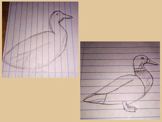
Algunos bocetos quedaron bien, otros simplemente los deseché; sin embargo, el que mejor quedó fue el que seleccioné para hacer mi dibujo. El boceto me sirvió para tener una idea clara que lo que quería hacer, así que tras terminarlo lo pasé a limpio, a la cartulina en donde lo pintaría.
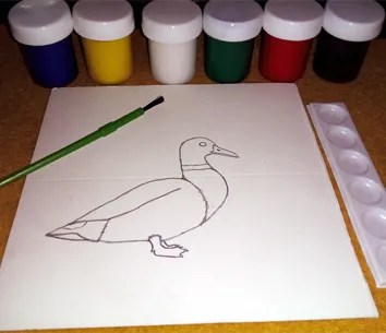
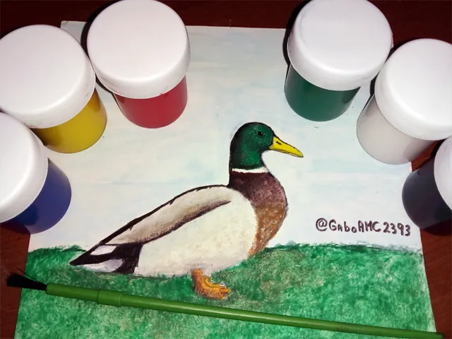
Como no soy un experto, no uso materiales profesionales. Estoy aprendiendo, así que por ahora continúo usando pinturas de las normales, de las que se encuentran en cualquier librería.
La verdad es que me gusta pintar con esto, se logra un bonito resultado y son buenas para los que estamos aprendiendo, ya que no son caras.
Para comenzar a pintar el cuerpo del dibujo, tuve que hacer varias mezclas de colores. Combiné blanco con un poco de marrón y amarillo para dar un color base, sobre el cual añadir los otros colores.
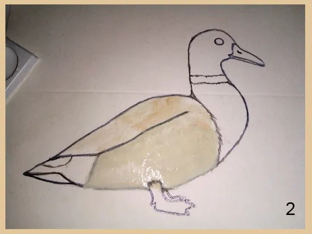
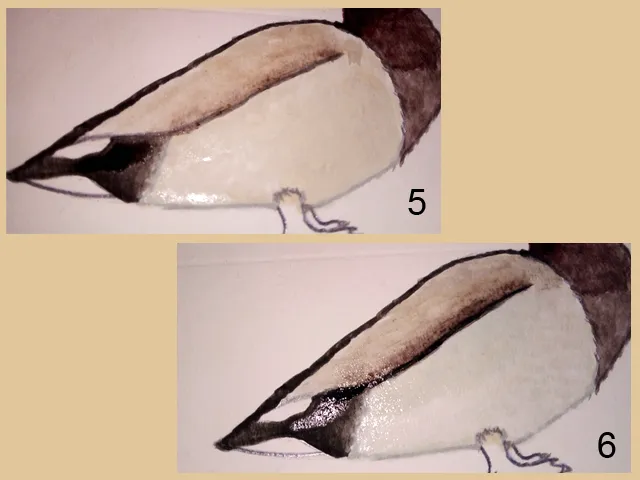
Continué con la cola, pintándola con color negro, cuidando de no pintar las áreas donde debían ir las plumas blancas (3). Luego continué pintando el cuello con color marrón, ayudándome con un pincel húmedo para crear tonalidades mas claras del mismo color (4).
Como dije, el primer color que añadí en el cuerpo serviría de color base para los siguientes colores que usaría. La parte superior del cuerpo tiene un degradado oscuro, el cual hice siguiendo la misma técnica que usé para pintar el cuello, un pincel húmero para degradar el mismo color marrón (5). Luego, con un pincel delgado, hice una línea para dividir las dos áreas del cuerpo del pato, la de arriba y la de abajo (6).
Posteriormente apliqué algunas capas de blanco con azul para crear tonalidades distintas en la parte de abajo del cuerpo, como si fuese sombra. También agregué más blanco en la parte superior, para aclarar un poco el degradado que había hecho anteriormente. Luego pinté las patas de color naranja, usando marrón para crear sombras..
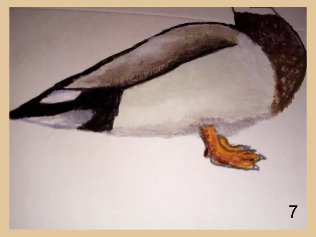
Hasta este punto el dibujo se ve de la siguiente manera:
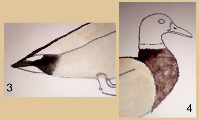
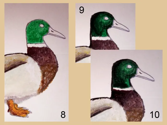
Después de haber terminado el cuerpo del pato, usé naranja para dar otra tonalidad al pecho, que antes había pintado solo con marrón. También usé un poco de blanco para pintar las pequeñas plumas que tiene en esta área marrón (8). Además de lo anterior, también comencé a pintar la cabeza del pato, la cual es de color verde.
Con pintura negra y a con un pincel húmedo, comencé a hacer los degradados para crear el efecto de iridiscencia que tiene este animal es su plumaje (9 y 10).
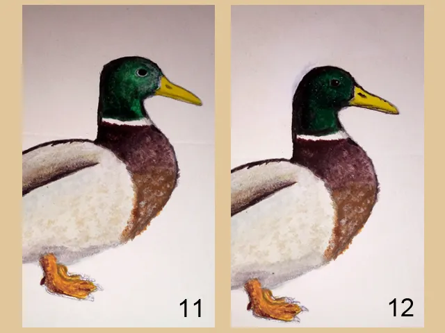
Lo último que hice, además de pintar el pico con amarillo, fue pintar el ojo y de esta manera terminé la cabeza del pato; sin embargo, me di cuenta que las proporciones no eran las correctas (11), así que usé pintura blanca para corregir, incluso mejoré un poco el degradado y el área de los ojos (12).
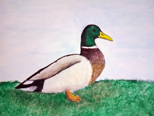
Como el dibujo estaba en un fondo blanco, le pinté un suelo verde simulando pasto, además de un fondo de cielo azul. Hice los últimos retoques y así quedó dibujo una vez terminado:
Me siento muy complacido con el dibujo porque es algo que no había intentado hacer antes. Sí tuve varias fallas antes de este dibujo, tuve que desechar un par más que hice; pero como dije, me siento complacido con este resultado.
¿Y a ustedes qué les pareció? Es el tercer dibujo que comparto aquí en HIVE y me gustaría saber qué opinan, o si tienen alguna sugerencia/consejo será bien recibida.
Bien amigos, esto ha sido todo por ahora. Espero de corazón que mi publicación haya sido de su agrado o, cuando menos, haya servido para entretenerlos un poco. Los invito, nuevamente, a dejar sus opiniones en los comentarios, estaré encantado de leerlos. Sin más que agregar, me despido entonces...
¡Hasta la próxima!
English version
Since relatively recently, about a month ago, I have been practicing my drawing and painting skills. I went from not knowing how to do anything, to being able to make pretty decent drawings, in my opinion.
My goal is to improve every day, try new things, set myself challenges and try to overcome them. I remember the first drawing I did was an owl, then I did a panda bear. Both drawings were similar to children's fairy tale characters, chubby and with huge eyes.
You can see the posts where I shared those drawings by following these links:
Owl: @gaboamc2393/weekend-of-seeds-painting-and
Panda Bear:@gaboamc2393/drawing-2-little-panda-engesp
Well, I was practicing with another kind of drawings closer to real life, that's how I decided to draw a duck. I made several attempts and to be honest some of them didn't turn out very well; however, I would like to share with you the result that I liked the most. So, here is my drawing of a Mallard.
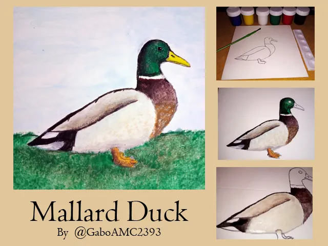
As I said, I was practicing before achieving something decent. I made several sketches on paper before drawing on the cardboard, as you can see in the image below:
Some sketches turned out well, others I simply discarded; however, the one that turned out best was the one I selected to make my drawing. The sketch helped me to have a clear idea of what I wanted to do, so after finishing it, I transferred it to the cardboard where I would paint it.
As I am not an expert, I do not use professional materials. I'm still learning, so for now I continue to use normal paints, the kind you can find in any bookstore.
The truth is that I like to paint with this, a nice result is achieved and they are good for those of us who are learning, as these are not expensive.
To start painting the body of the drawing, I had to make several color mixtures. I combined white with a little brown and yellow to give a base color, on which to add the other colors.
I continued with the tail, painting it with black color, taking care not to paint the areas where the white feathers should go (3). Then I continued painting the neck with brown color, helping me with a wet brush to create lighter shades of the same color (4).
As I said, the first color I added on the body would serve as a base color for the following colors I would use. The upper part of the body has a dark gradient, which I did following the same technique I used to paint the neck, a damp brush to gradient the same brown color (5). Then, with a thin brush, I made a line to divide the two areas of the duck's body, the top and the bottom (6).
Then I applied some layers of white with blue to create different tonalities in the lower part of the body, as if it were a shadow. I also added more white on the upper part, to lighten a little the gradient I had done before. Then I painted the legs orange, using brown to create shadows...
Up to this point the drawing looks as follows:
After finishing the body of the duck, I used orange to give another shade to the chest, which I had previously painted only with brown. I also used some white to paint the small feathers in this brown area (8). In addition to the above, I also started painting the duck's head, which is green.
With black paint and a wet brush, I started to make the gradients to create the iridescence effect that this animal has in its plumage (9 and 10).
The last thing I did, besides painting the beak with yellow, was to paint the eye and in this way I finished the duck's head; however, I realized that the proportions were not correct (11), so I used white paint to correct, even improving a little the gradient and the eye area (12).
As the drawing was on a white background, I painted a green ground simulating grass, in addition to a blue sky background. I made the final touches and this is how the drawing looked once it was finished:
I am very pleased with the drawing because it is something I had not tried to do before. I did have several failures before this drawing, I had to discard a couple more that I did; but as I said, I am pleased with this result.
What did you think? This is the third drawing I've shared here on HIVE and I'd like to know what you think, or if you have any suggestions/advice it would be welcome.
Well friends, that's all for now. I sincerely hope that my publication has been to your liking or, at least, has served to entertain you a little. I invite you, again, to leave your opinions in the comments, I will be happy to read them. With nothing more to add, I'll say goodbye then...
See you next time!
Imagenes editadas con Photoshop
Traducido con DeepL
Photos edited with Photoshop
Translated with DeepL
Helio: Microrrelato Ilustrado
Pantera Sculpture
Gabo Play Megaman x4 #5